A Look at the Emerald BI-GanttView
With the new release of the Emerald BI-GanttView visual for Power BI, we wanted to take the chance to look at some of the features that this visual offers.
BI-Ganttview is designed for creating, editing, and displaying Gantt charts, and will be especially helpful for Primavera P6 users and schedulers. Creating the chart is quick and easy - once you have your data downloaded to Power BI, you can simply drag and drop your data into different categories to start building out your Gantt chart.
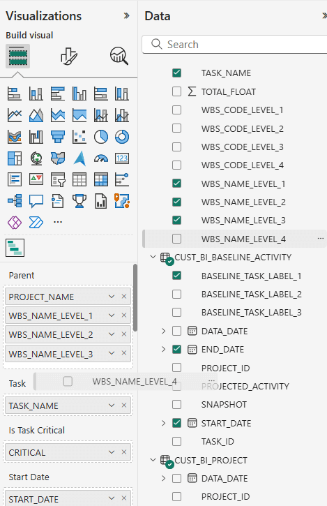
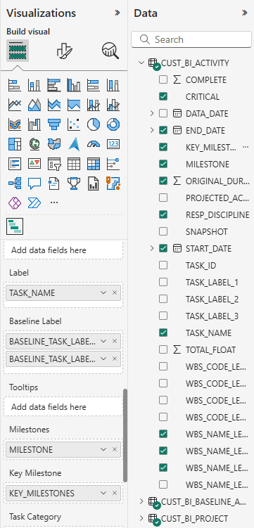
In the screenshot below, you can see the list of data that we have pulled from P6 and how it can be dragged into these categories under “Build visual”.
Filling out these categories will build the basic chart that you want to make. Let’s talk about how to use some of the features that BI-GanttView offers, starting with task bars.
Task bars use activity data to build out the main part of your Gantt chart. To create your task bars, you will want to fill the “Task” data field. In the screenshot below, we are using “TASK_NAME” as the data for that section.
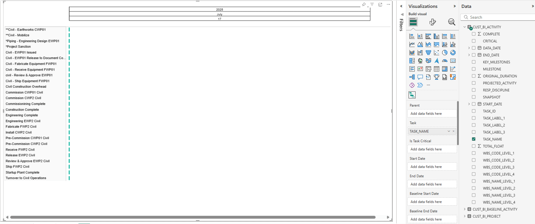
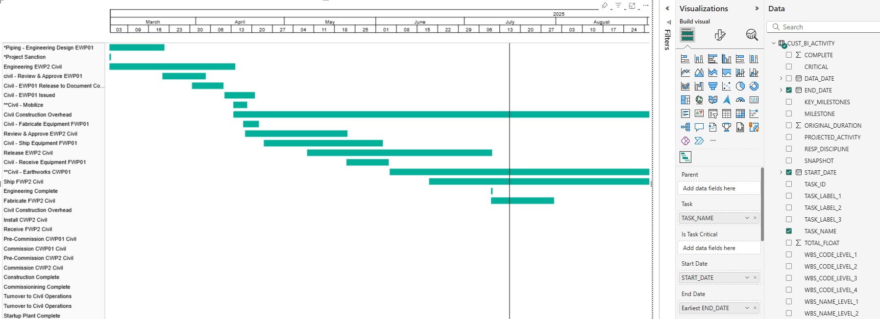
This creates an activity table, but as you can see, there are no durations yet, so each task bar is simply a dot. Once we add START_DATE and END_DATE data to the “Start Date” and “End Date” categories, the Gantt chart will start to take shape.
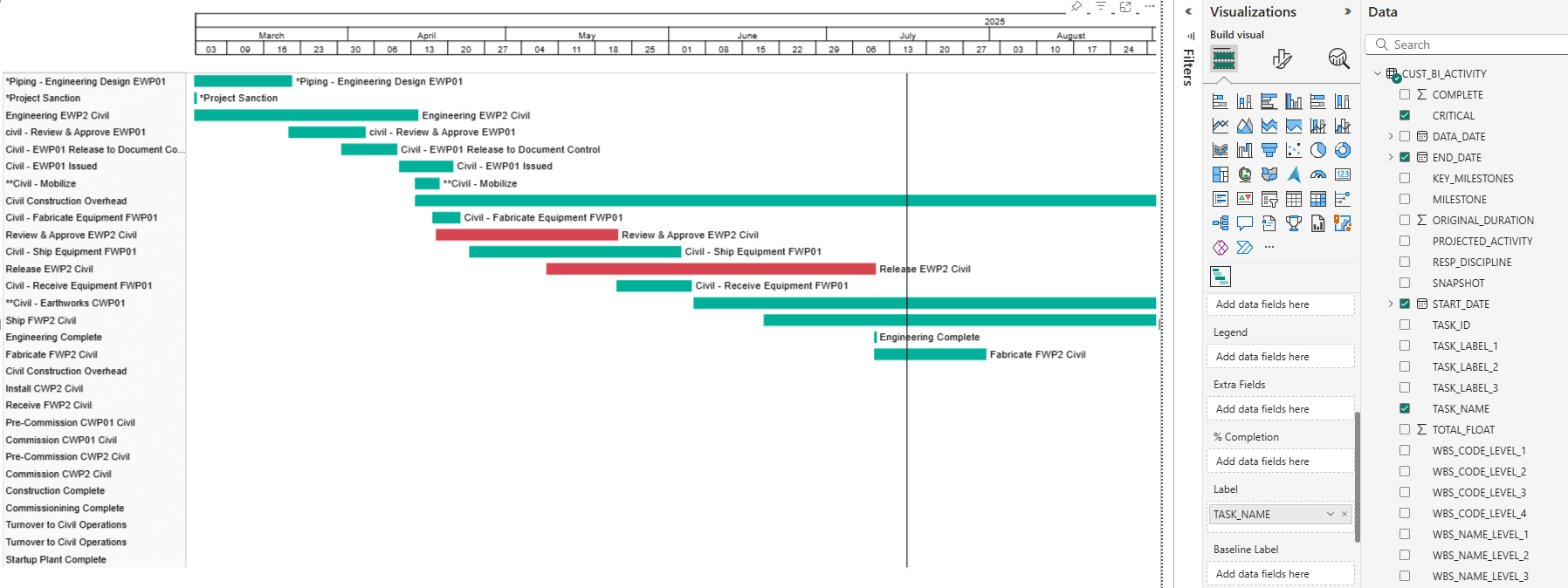
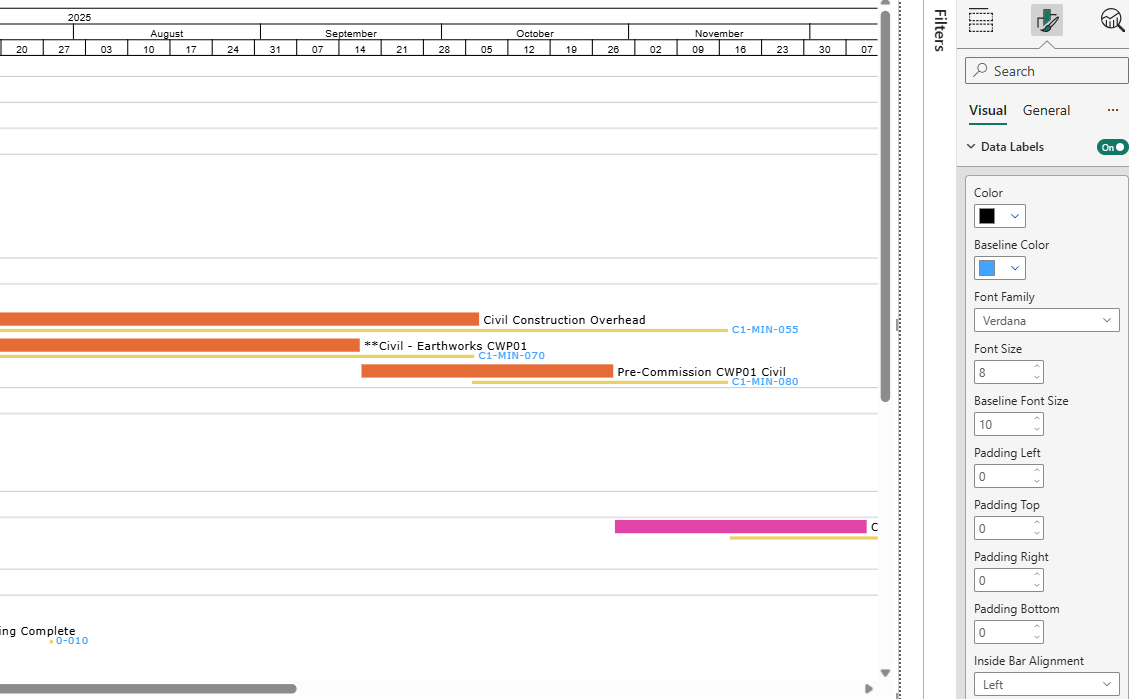
The eagle-eyed among you might notice the “Is Task Critical” data field in between “Task” and “Start Date”. This is where we can tell BI-GanttView to differentiate between critical and non-critical tasks, using our data from P6. You can see in the screenshot below, that once we added the CRITICAL data to that section and made some customization adjustments, some bars have turned red.
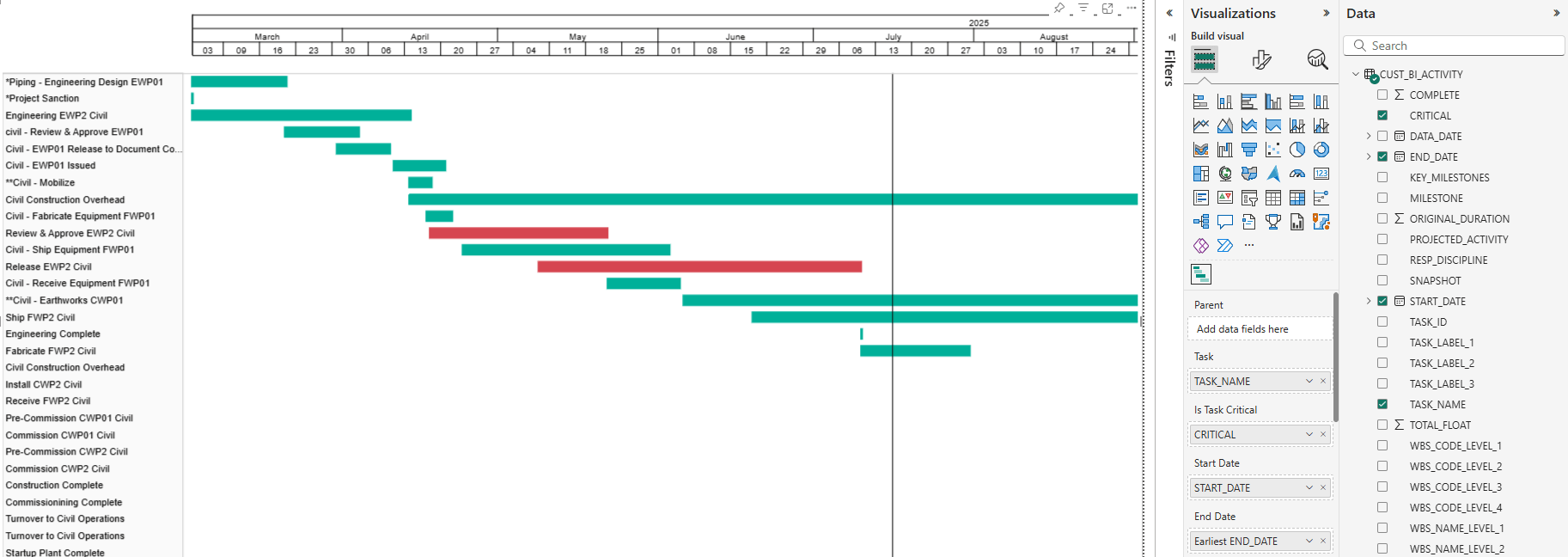
These are our critical tasks or activities. We have chosen to set them as red, to mirror P6, but you can choose any colour. We will go into the customization options for bars in a moment.
Once you have your task bars created, you can add labels for them. We chose the task name as the label.
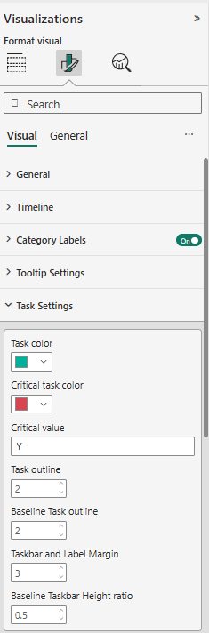
To customize your task bars, move from the “Build Visual” tab in the Visualizations menu (the one that looks like two blocks on top of each other), over to the “Format Visual” tab (the one with the paintbrush over a bar graph). Here you can customize the colours and labels of your bars, including the colour of your critical bars, and adjust your bar labels as well, with the ability to change font type, size, placement, and more.
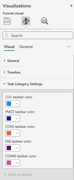
Task bars can also be given different colours based on their groupings. If you go back into the “Build Visual” section and scroll down, you will find a data field named “Task Category”. Whatever data point you pull into here will control the grouping of these tasks. We will group by responsible discipline.
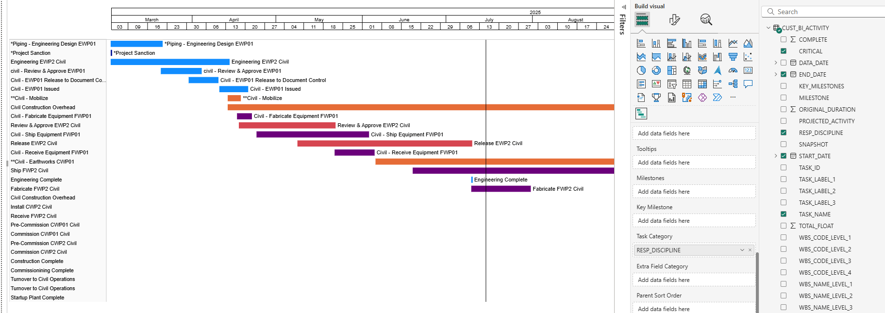
You’ll see that the colours have changed. You can control the colour for each group by going back into the “Format Visual” section where you will see a new section: Task Category Settings. Choose the colours for each group here.
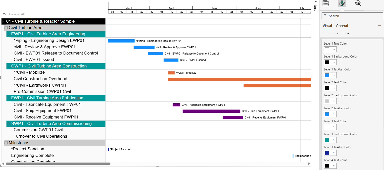
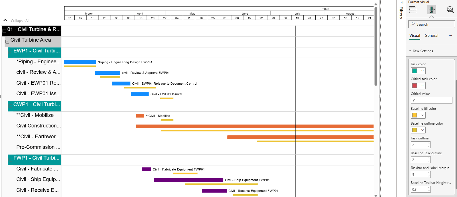
Now, in the previous screenshots, you may have noticed that the activity table to the right is looking a bit flat. Let’s fix that, shall we? In the screenshot below, we have gone back into the “Build Visual” section of the Visualization menu.
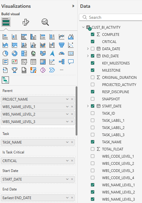
You can see that we have added some data in the “Parent” data field. These are the hierarchy levels for the chart with each successive data point being a lower tier of the hierarchy. You can see how this arrangement appears in the chart itself in the screenshot below.
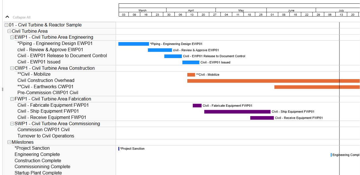
In the chart along the lefthand side, PROJECT_NAME has been made the highest level of the hierarchy, followed by the WBS_NAME_LEVEL_1, WBS_NAME_LEVEL_2, and finally WBS_NAME_LEVEL_3. These sections can be collapsed at will. You have an unlimited amount of hierarchy levels that you can add, and you can sort by WBS, as we have here, or by other classifications as needed.
This activity table is looking like it needs a little customization. Swinging back into the “Format Visual” section, customization options for the activity table can be chosen in “Category Labels” and “Hierarchy settings.” Category Labels allows you to choose the colour, type, and size of the font for the base level, while Hierarchy settings is where you change the colour of the font for the different hierarchy levels, as well as the background colour for each. You can also adjust the margin for the task bars and activity table bars under Task Settings. Let’s see what they look like now.
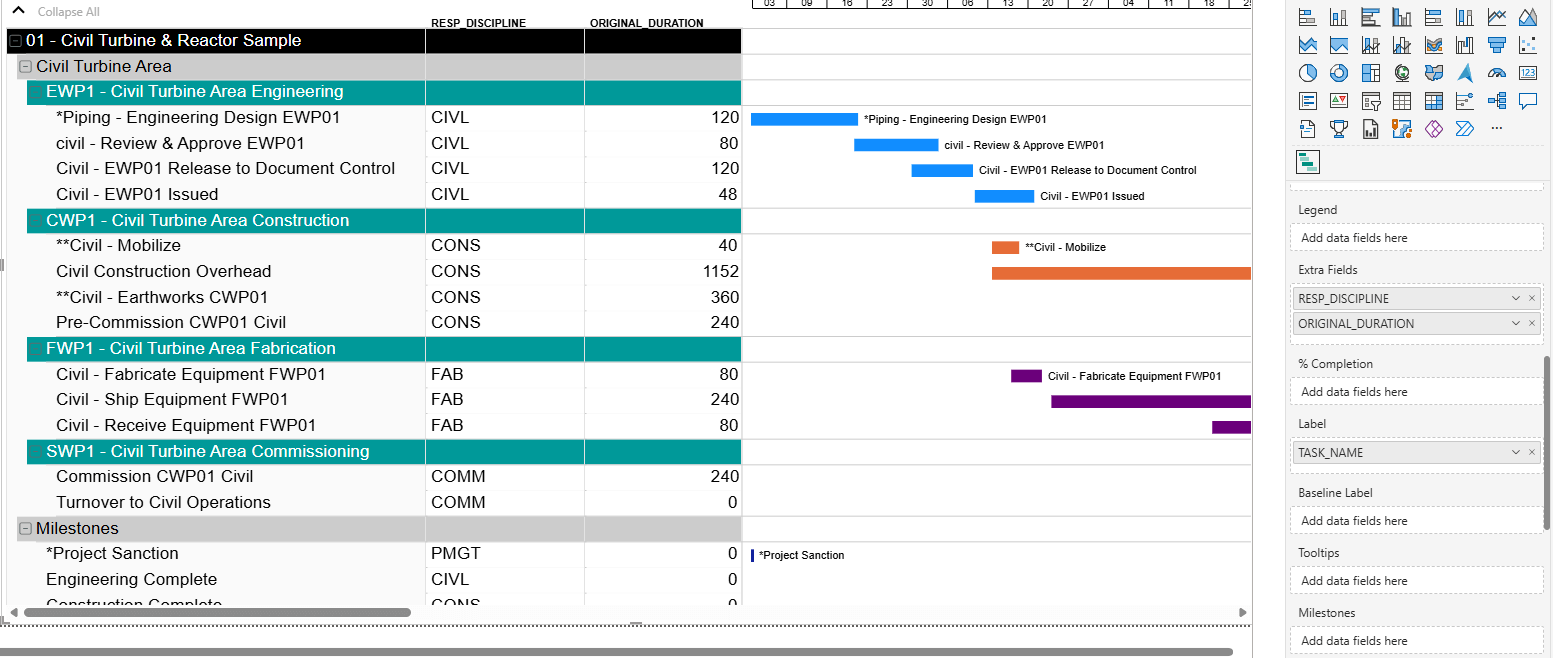
Extra fields can also be added to your activity table using the “Extra Fields” category under “Build Visual”. You can add many extra columns so that you can see the information most important to you all spread out in a single place. In the screenshot below, we have added a responsible discipline column, as well as an original duration column. These can also be customized.
BI-GanttView also supports baselines. These are added in much the same way as task bars are.
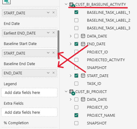
Filling out the “Baseline Start Date” and “Baseline End Date” fields will populate your chart with baselines. You can also add baseline labels.
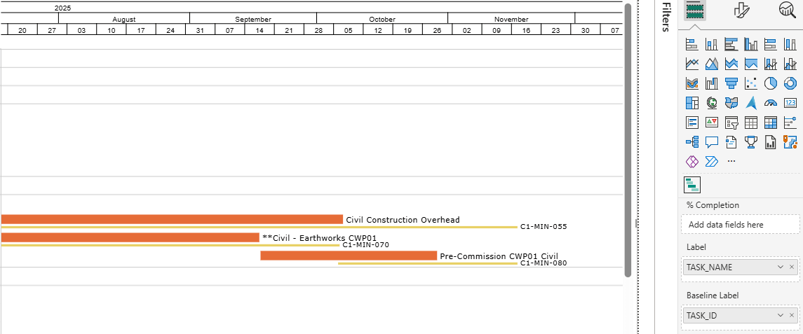
You can then customize your baselines by choosing the colour, height, and outline. These are all chosen similarly to how you customize your task bars in the “Format Visual” section, in “Task Settings”.
To adjust the baseline labels, such as font colour and size, click on “Data Labels”.
Lastly, let’s look at milestones. There are two data fields for milestones under the “Build visual” section: “Milestones” and “Key Milestone”. The data in the “Milestones” field will determine whether we put the milestones in the chart or not. The data in the “Key Milestone” field will determine whether the milestones will be displayed along the timeline instead of within the chart.
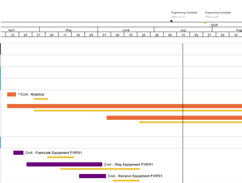
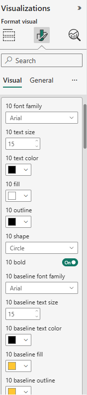
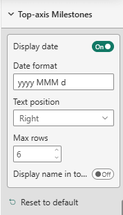
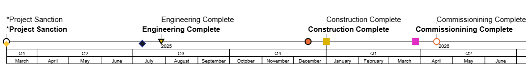
Once you’ve placed your milestones, you can customize them individually to your liking. Once again, this is done in the “Format Visual” tab. You can customize the shape and colour of each milestone type, as well as font style, colour, and size for the milestone labels from the ”Milestones“ section. Top axis milestones can be further customized in the “Top-axis Milestones” section where you can choose whether the date is displayed for each milestone, the text position, and more.
Below is an example of newly customized milestones. The milestones that are not bolded are the baseline milestones.
Before we end this blog, let’s see what a fully customized Gantt chart can look like:
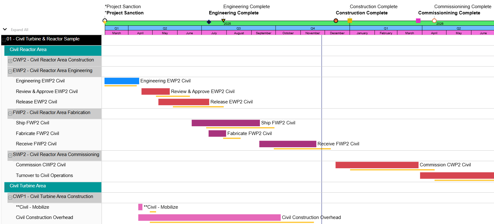
As you can see, there are many options and features in BI-GanttView allowing you to make Gantt charts that fit you and your team’s unique needs. In this blog, we covered only some of the many features and customization options offered, but there are many more for you to explore.
The BI-GanttView is available now on the Microsoft AppSource Store.
No video selected.
In the screenshot below, you can see the list of data that we have pulled from P6 and how it can be dragged into these categories under “Build visual”.
Filling out these categories will build the basic chart that you want to make. Let’s talk about how to use some of the features that BI-GanttView offers, starting with task bars.
Task bars use activity data to build out the main part of your Gantt chart. To create your task bars, you will want to fill the “Task” data field. In the screenshot below, we are using “TASK_NAME” as the data for that section.
This creates an activity table, but as you can see, there are no durations yet, so each task bar is simply a dot. Once we add START_DATE and END_DATE data to the “Start Date” and “End Date” categories, the Gantt chart will start to take shape.
The eagle-eyed among you might notice the “Is Task Critical” data field in between “Task” and “Start Date”. This is where we can tell BI-GanttView to differentiate between critical and non-critical tasks, using our data from P6. You can see in the screenshot below, that once we added the CRITICAL data to that section and made some customization adjustments, some bars have turned red.
These are our critical tasks or activities. We have chosen to set them as red, to mirror P6, but you can choose any colour. We will go into the customization options for bars in a moment.
Once you have your task bars created, you can add labels for them. We chose the task name as the label.
To customize your task bars, move from the “Build Visual” tab in the Visualizations menu (the one that looks like two blocks on top of each other), over to the “Format Visual” tab (the one with the paintbrush over a bar graph). Here you can customize the colours and labels of your bars, including the colour of your critical bars, and adjust your bar labels as well, with the ability to change font type, size, placement, and more.
Task bars can also be given different colours based on their groupings. If you go back into the “Build Visual” section and scroll down, you will find a data field named “Task Category”. Whatever data point you pull into here will control the grouping of these tasks. We will group by responsible discipline.
You’ll see that the colours have changed. You can control the colour for each group by going back into the “Format Visual” section where you will see a new section: Task Category Settings. Choose the colours for each group here.
Now, in the previous screenshots, you may have noticed that the activity table to the right is looking a bit flat. Let’s fix that, shall we? In the screenshot below, we have gone back into the “Build Visual” section of the Visualization menu.
You can see that we have added some data in the “Parent” data field. These are the hierarchy levels for the chart with each successive data point being a lower tier of the hierarchy. You can see how this arrangement appears in the chart itself in the screenshot below.
In the chart along the lefthand side, PROJECT_NAME has been made the highest level of the hierarchy, followed by the WBS_NAME_LEVEL_1, WBS_NAME_LEVEL_2, and finally WBS_NAME_LEVEL_3. These sections can be collapsed at will. You have an unlimited amount of hierarchy levels that you can add, and you can sort by WBS, as we have here, or by other classifications as needed.
This activity table is looking like it needs a little customization. Swinging back into the “Format Visual” section, customization options for the activity table can be chosen in “Category Labels” and “Hierarchy settings.” Category Labels allows you to choose the colour, type, and size of the font for the base level, while Hierarchy settings is where you change the colour of the font for the different hierarchy levels, as well as the background colour for each. You can also adjust the margin for the task bars and activity table bars under Task Settings. Let’s see what they look like now.
Extra fields can also be added to your activity table using the “Extra Fields” category under “Build Visual”. You can add many extra columns so that you can see the information most important to you all spread out in a single place. In the screenshot below, we have added a responsible discipline column, as well as an original duration column. These can also be customized.
BI-GanttView also supports baselines. These are added in much the same way as task bars are.
Filling out the “Baseline Start Date” and “Baseline End Date” fields will populate your chart with baselines. You can also add baseline labels.
You can then customize your baselines by choosing the colour, height, and outline. These are all chosen similarly to how you customize your task bars in the “Format Visual” section, in “Task Settings”.
To adjust the baseline labels, such as font colour and size, click on “Data Labels”.
Lastly, let’s look at milestones. There are two data fields for milestones under the “Build visual” section: “Milestones” and “Key Milestone”. The data in the “Milestones” field will determine whether we put the milestones in the chart or not. The data in the “Key Milestone” field will determine whether the milestones will be displayed along the timeline instead of within the chart.
Once you’ve placed your milestones, you can customize them individually to your liking. Once again, this is done in the “Format Visual” tab. You can customize the shape and colour of each milestone type, as well as font style, colour, and size for the milestone labels from the ”Milestones“ section. Top axis milestones can be further customized in the “Top-axis Milestones” section where you can choose whether the date is displayed for each milestone, the text position, and more.
Below is an example of newly customized milestones. The milestones that are not bolded are the baseline milestones.
Before we end this blog, let’s see what a fully customized Gantt chart can look like:
As you can see, there are many options and features in BI-GanttView allowing you to make Gantt charts that fit you and your team’s unique needs. In this blog, we covered only some of the many features and customization options offered, but there are many more for you to explore.
The BI-GanttView is available now on the Microsoft AppSource Store.
About the Author
Amy Paul B.A. - Marketing/OPS
Originally joining Emerald as a summer student in 2018 and 2019, Amy now works in marketing and OPS full-time. Her influence can be seen in the PowerPoint presentations for various webinars put on by Emerald, and she has written and edited blogs and case studies.
Lately, Amy is working on advancing marketing initiatives and helping to set up production environments in Oracle Unifier, as well as presenting the occasional webinar or two.
She spends her free time writing, playing video games, and reading horror books.
Lately, Amy is working on advancing marketing initiatives and helping to set up production environments in Oracle Unifier, as well as presenting the occasional webinar or two.
She spends her free time writing, playing video games, and reading horror books.
