A Look into P6-Reporter Custom Views
As you’d likely expect, P6-Reporter (previously EP-datawarehouse) delivers you data in tables that represent your common P6 items: Projects, Activities, Resource Assignments, and Resources. There’s a lot you can do with these, but to create great reports, you’ll often want to manipulate these tables too:
- prepare the data, so it’s ready to feed your visuals
- prepare the data, so it can describe relationships between your data
- reduce the amount of information being passed in so that your reports are light and responsive
Preparing the Data to Feed Your Visuals
Let’s start with a simple example, say you want to create a chart like the following:
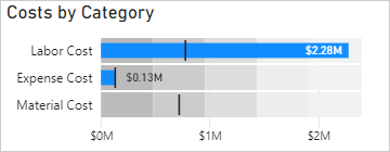
The dark lines represent the baseline values, which are the targets this project would like to reach. The blue bars are the actual amounts at the current point in the project.
All of the data required for this view is in the Projects table.

However, the visual we want to create needs three values: the category, the actual amount, and the target value. To achieve this, we have a view named ‘project cost by category’ that rearranges these columns by category like this:
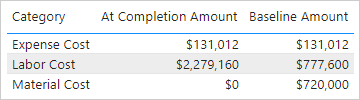
Using this view, creating this visual is easy. All you have to to is connect the three columns required by the visual, perhaps a bit of styling and your chart is done.
Our ready-to-use reports use many views like these, some equally as simple and some, such as our ‘milestone trending’ and ‘racetrack views’, much more complex.
It’s important to realize that even if you want to create reports that look quite different from the out-of-the-box reports that you’ve seen in our demos, there may still be visuals that you’ll want to create that will be achieved much faster using our ready-made views.
Preparing the Data to Describe Relationships
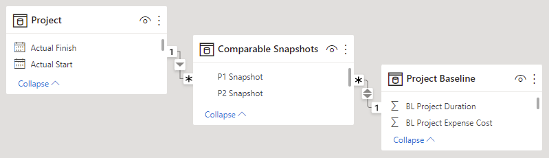
One of the great things about P6-Reporter snapshot is that it allows you to compare a project to itself or its baseline for any date that a snapshot was captured. That way you see how things have changed since last week, last month, or last year. But your database may have many projects with many snapshots for each, so how do you tell your reporting software which project can be compared to which? One such view that we use for this is named ‘comparable snapshots’.
The first column lists the projects that we can look at, and the second column is a list of projects and baselines that are eligible to be compared to. Project snapshots end in ‘.P’ and baselines in ‘.B’. We use the approach that the selected P2 Snapshot should only be compared to snapshots or baselines that were taken on or before it was taken, so as we go back in time we naturally see less options for comparison.
| P2 Snapshot | P1 Snapshot |
|---|---|
| Facility 2B.2021-12-15.P | Facility 2B.2021-10-15.B |
| Facility 2B.2021-12-15.P | Facility 2B.2021-11-15.P |
| Facility 2B.2021-12-15.P | Facility 2B.2021-12-15.B |
| Facility 2B.2021-12-15.P | Facility 2B.2021-10-15.P |
| Facility 2B.2021-12-15.P | Facility 2B.2021-11-15.B |
| Facility 2B.2021-11-15.P | Facility 2B.2021-11-15.B |
| Facility 2B.2021-11-15.P | Facility 2B.2021-10-15.P |
| Facility 2B.2021-11-15.P | Facility 2B.2021-10-15.B |
| Facility 2B.2021-10-15.P | Facility 2B.2021-10-15.B |
In the reporting software, the view is used to join projects with eligible baselines. Note: Project Baseline can simply be a copy of the projects table or another custom view which we’ll discuss further on.
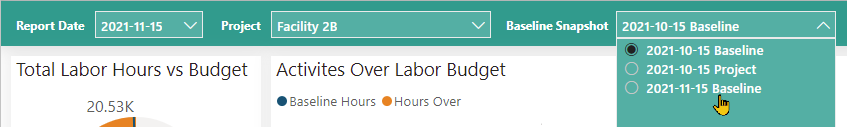
Now we can set up the report so the user can select the project plus report date and baseline they want to compare.
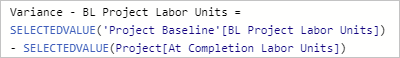
And we can generate measures using values from the Project and Project Baseline tables.
The comparable snapshots view can also be used for comparisons between activities, as well as a variation of the ‘project costs by category’ view mentioned earlier.
Reducing the Amount of Information being Passed In
The less data you pass into your reports, the faster they will load and the more responsive they will be for users. That’s why we have several views that reduce the data being passed in. The ‘project baseline’ view above is a great example of this. Baselines in P6 are actually projects, so you could just take them directly from the projects table, but when you are using them in reports, you won’t want many of their fields:
- You’d never want to include actuals or remaining
- You probably have no interest in codes or UDFs because you can get those from the project itself
- And because they are baselines, they won’t contain certain values such as variances against other baselines
In short, the list of columns that you are interested in for baselines will be much shorter than the list of columns in your projects table.
This data reduction also makes it easier to find the fields you’re looking for when building the reports. It also appropriately renames columns to make your report fields and measures much more intuitive.
While this may not sound like a big gain for your projects table, because it is not relatively large, the same concept can be applied elsewhere. We also offer data reduction views for activity baselines, resources and resource spreads.
Recap
Why use our Custom Views?
Preparing the data to feed your visuals = useful, interesting charts without time lost developing and testing your own views
Preparing the data to describe relationships = allowing your readers to dynamically compare projects against past versions and baselines
Reducing the amount of information being passed in = light, responsive reports
About the Author
James Andrade - Integration Specialist
James is a professional software developer and was trained at SAIT in Calgary. He specializes in Primavera P6 report development using Power BI, Tableau and Oracle Data Visualization, from a variety of sources, including Primavera Data Warehouse, direct-to-P6 reporting and Emerald's own P6-Reporter.
