Why I No Longer Dread Morning Management Meetings on a Turnaround Project
How to Quickly and Effectively Develop S-Curves With Primavera P6 Project Data
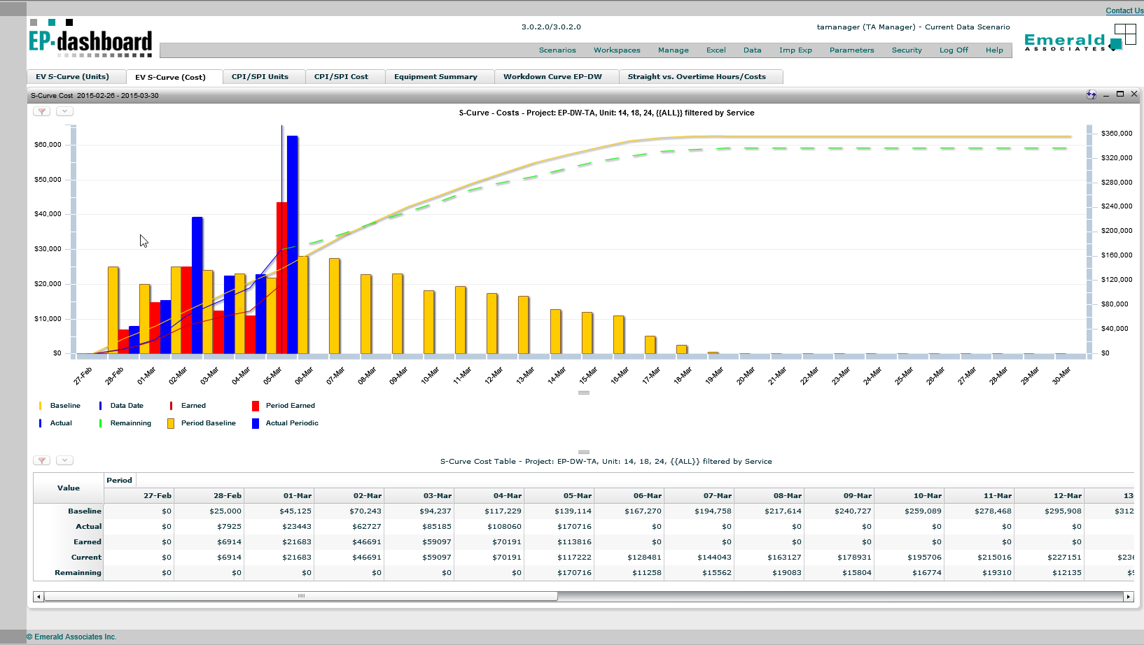
I was working on TA project and was asked to provide S-Curve (Units and Cost) reporting for every morning management meeting. The client wanted to observe project trends from a schedule and cost perspective for each unit, piece of equipment and also for various contractors.
To create such reports I had to dump the project information into a spread sheet from Primavera P6 at the end of each shift to record the history of actual and remaining activities. Then I had to group, sort and filter the data properly, as well as write a particular formula to develop the graphs based on different criteria.
Looking down the road this task was not exactly what I really wanted to spend my time on, especially since I couldn’t easily change the graphs filtering, grouping, and sorting during the meeting if some of the managers wanted look at something from another perspective. I constantly had to tell them that I would have to create the graph they were requesting and bring it to the following meeting, which was obviously not ideal.
To add to the frustration I have to admit that there were a couple of times I made errors in my formula and it took me a long time to fix. All of the graphs had their own formula and if I wanted to change anything I had to go to each graph and make sure everything was ok.
Finally things started to look up when the client decided to purchase Emerald’s EP-dashboard and P6-Reporter (previously EP-datawarehouse) reporting solution. Life was immediately made easy for me!
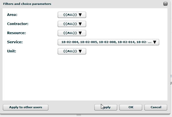
With Emerald’s reporting solution in place I only needed to take a snapshot of the project at the end of each shift using P6-Reporter. I literally only had to change two project codes, press F5 and sit back while P6-Reporter snapshotted the latest status of the project. Once the snapshot was complete I could go to EP-dashboard and look at the graphs that I developed earlier along with the live data and filter and group it all however I needed it.
Now I love morning management meetings! I can show them the curves with various options for filtering and grouping. Creating the graphs has been simplified, there is less room for error, and I can answer their questions in the actual meeting instead of making them wait until the next one before I can give them what they need.
Below is an example:
S-Curve-Cost
Applied Filter
If you have any questions regarding reporting and Primavera P6 please contact us so we can talk to you about our P6 Reporting tools. I can’t believe the time I saved, not to mention the transparency the tools brought our client.
